


The trends in SEO have marked the path towards this change, and in March, Google made the official announcement that it will crawl and index all websites using the Mobile-First Index. The fact that the use of mobile devices in web browsing has gained such dominance that Google decided to make this move to simplify the user experience. As a result, all content showing up in a Google search result will be adapted to mobile.
This Google index that adapts to mobile UX has been in the works since 2016 to move websites toward a Mobile-First context. Ever since its inception, Mobile-First has been imperative to land optimal SEO positioning. Plus, if your content for mobile is not the same as on desktop, you can have problems. After years of operation, Google reported that “70% of all websites shown in our search results have changed and are crawled using the Mobile-First index.”
Despite all these advances, the other 30% should know that there’s no turning back after the Google September 2020 Core Update. You’ll need to optimize these websites to fulfill a mobile strategy to not only appear in search results on Google but to achieve adequate positioning.
While we already mentioned that Google has been testing this index since 2016, a year-and-a-half later in March 2018, they announced the implementation of the mobile crawler that evaluates Google positioning on all websites. That was how we gave a warm welcome to the Mobile-First Index.
The March 2018 announcement of the roll-out noted that “our crawling, indexing, and ranking systems have typically used the desktop version of a page’s content, which may cause issues for mobile searchers when that version is vastly different from the mobile version. Mobile-first indexing means that we’ll use the mobile version of the page for indexing and ranking, to better help our – primarily mobile – users find what they’re looking for.”

This change was an apparent response to user habits since 80% of Internet users around the world connect using a mobile device, and more than 50% of them run quick searches on search engines using their smartphone. Google kept having a single index when showing search results, and while they have indexed desktop versions over the past few years, mobile versions have gained territory. This gradual process of Google updating their SEO crawling for positioning will culminate to make one of 2020’s most important SEO trends a reality. What is it? Google will crawl every website using the Mobile-First index to determine Google positioning for sites in search results.
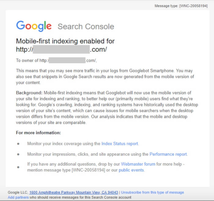
This update to Google’s positioning strategies will force companies to have mobile-adaptable websites if they want to show up in Google search results. If you would like to find out if your site’s already on the Mobile-First Index, you can figure it out in Google Search Console, the tool that will help you supervise your site and ensure it keeps showing up in the results.
This change marks a before and after in corporate SEO positioning strategies. You will now need to focus on these factors:
Your website’s mobile version is the one that you should have as the most-optimized since Google will visit it before the others. Your website must be mobile-adaptable, so it shows up correctly on those websites. The best route is to create a webpage for mobile-first and then adapt it to larger devices.
Your content has to be the same on mobile as it is on a desktop because if we omit some information on a mobile version, Google won’t factor it into its positioning results. Structured data and metadata are also part of this equation and should be the same in both versions, although some developers didn’t add them to make the website weigh less to operate more quickly.
You can also “hide” content with accordions. An accordion sector is where content is hidden, and we can only see the titles. By clicking on them, a user will then get to see the following content. You can use this formula to organize the information since Google will take it into account for determining your ranking.
Google will also keep loading speed as a critical factor when determining places in a ranking since the situation on a mobile device has nothing to do with that of a computer. That implies your web design needs to be straightforward, usable, and light.
Besides the more-technical vision, like we just saw, we also need to keep the customer experience in mind. If we didn’t do it before, now is an excellent time to redesign our content strategy. To be entirely focused on mobile content, we have to walk in our user’s shoes, know what he or she is looking for, what he or she wants to find, and in what format, in an attractive and structured design.
The suggestions Google has been making for years about Mobile-First designs are now mandatory for any business that has part of its business strategy depending on its website. Google will send out a warning with information if our site is not optimized for mobile devices. In this vein, and if we’re talking about 360° Marketing strategies, mobile SEO has an undeniably defining role.
We live in an omnichannel world where users and customers complain about the brands that do not treat us the same online as they do in a brick-and-mortar store. Google is merely applying this user experience to the way we use the internet with our phones.